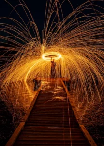
Spinning Fire: A Guide to Steel Wool Photography
I think steel wool photography creates some of the most amazing images you can capture
Share the Love This Valentine’s Day – 25% Off

Ever wondered why some photos grab your attention while others fade into the background? The secret might lie in the photographer’s clever use of contrast. This powerful tool can transform ordinary shots into captivating visual stories, shaping the mood and impact of your images.
Contrast in photography is all about differences: light versus dark, vibrant versus muted, sharp versus soft. It’s the magic ingredient that adds depth, drama, and dimension to your photos.
By mastering contrast, you can guide your viewer’s eye and evoke specific emotions, turning a simple snapshot into a work of art.
Whether you’re shooting landscapes, portraits, or street scenes, understanding contrast is key to elevating your photography. From high-contrast images that pop with intensity to low-contrast shots that exude a dreamy calm, the possibilities are endless. Are you prepared to discover how contrast can transform your images and enhance your visual impact?
Contrast in photography refers to the difference between light and dark areas in an image, which enhances the overall depth and dimension. It can influence mood, highlight important subjects, and draw attention to specific elements, making it a crucial aspect of composition and visual storytelling.
Contrast is key in photography basics and image composition. It’s the difference in brightness or colour that makes subjects pop. Knowing about contrast helps you make more striking images and find your own style.
Contrast is key for grabbing viewer attention and setting a mood. High-contrast images have strong colours and textures, showcasing power and energy through colour contrast. Low-contrast photos mix light and dark, giving a softer look with fewer highlights and shadows.
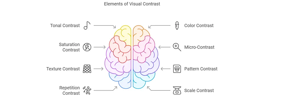
In photography, there are various types of contrast to be observed:
We’ll go over all of these in detail to help you improve your ability to create photos that effectively capture attention through contrast. You’ll also share your vision more clearly.
Tonal contrast is crucial in black and white photos. It shows the difference in brightness between light and dark parts. This makes images more captivating by playing with shadows and highlights.
Grayscale images have 256 levels of grey, from black (0) to white (255). The use of these tones alters the mood of your photo.
| Contrast Level | Characteristics | Mood |
|---|---|---|
| High | Strong black and whites, limited midtones | Often used in edgy, dramatic visuals to enhance their emotional impact. |
| Normal | Even distribution of tones | Balamed, natural |
| Low | There are gentle hues, not just black or white. | Dreamy, ethereal tones can create a low-contrast effect that evokes a sense of calm. |
Lighting is key for tonal contrast. Bright light makes images with deep shadows and bright spots. Soft light makes images with softer tones.
Later on, you can adjust tonal contrast in photography using curves or dodging and burning techniques. These tools help you adjust shadows and highlights. This makes your black-and-white photos more striking.
Colour contrast can shape the mood and feel of your photos. Knowing the colour wheel helps you understand colours in a striking way. Complementary colours, opposite each other on the colour wheel, create a strong contrast and make subjects stand out.
Warm colours like reds and oranges feel cozy and intimate. Cool colours, blues and greens, bring calmness. Mastering colour contrast lets you control what catches the eye and the mood of your photos.
To use colour contrast well:
High-contrast photos use colours like bright yellow and blue. Low-contrast photos use similar colours. By playing with colour contrast, you can tell powerful stories and stir emotions in your photos.
Colour is a power that directly influences the soul.
Wassily Kandinsky
Let’s switch genes for a moment Micro-Contrast effects our image in a different way. It’s all about how well your lens can capture the tiny differences in brightness within a single color. Imagine taking a picture of a red apple. Micro-contrast helps show all the subtle shades of red, from the brightest highlights to the deepest shadows. This makes the apple look more realistic and 3D, almost like you can reach out and touch it.
High micro-contrast makes your life easier! It helps your camera focus more accurately, both manually and automatically. Plus, you won’t need to use those super-strong sharpening tools in your photo editing software, which can sometimes make your pictures look unnatural
Imagine zooming in really close on a photo. Can you see all the tiny details? That’s where micro-contrast comes in! It’s like the super-zoom for your eyes, showing all the subtle differences in light and dark within a small area. Think of a weathered rock – micro-contrast makes all those little cracks and bumps really pop.
Saturation contrast can help make your photos stand out. It’s about the colour intensity in your images. Adjusting saturation changes how bright or dull your colours are.
High-saturation contrast brings out bright, intense colours next to softer ones. This makes your image exciting and draws attention. Low saturation, on the other hand, gives a softer, more muted look.
Here’s how saturation affects your images:
Cameras capture a wider colour range than printers can display. This is true for bright colours. So, be careful when adjusting saturation for prints.
Finding the right balance in saturation contrast is important. It helps you get the right look without overdoing it. Experiment with various levels to observe how they alter the mood and focus of your image. With practice, you’ll get good at using colour intensities to make great photos.
When you explore photography, you’ll find the magic of micro-contrast. It’s a small but key part that makes images sharp and clear. Micro-contrast shows the tiny changes in tone within small parts of a photo. It highlights textures and details that one might otherwise overlook.
Think of how to photograph a rugged landscape with rocky cliffs. High micro-contrast makes every small detail stand out. It gives your photo a gritty, touchable feel. But low micro-contrast makes your photo soft and dreamy, ideal for portraits or misty mornings.
Mastering micro-contrast is all about knowing how it changes your photo’s look. Too much makes images harsh, too little dull. Finding the right balance makes your photos stand out, showing off the small details that make them special.
Contrast in pattern or texture makes your photos richer. Mixing different visual patterns and textures creates a deep contrast. This draws the viewer’s eye, making the image more interesting.
To capture textural contrast, try these tips:
Professional photographers often use texture to make their images stand out.
When working with patterns, consider these options:
Remember, curves in texture images can either guide the viewer’s eye or spread throughout the image. The key is to ensure they harmonize with the overall composition.
By mastering contrast in pattern and texture, you’ll improve your photography skills. Mastering this technique is what makes professional photographers different from others.
Contrast breaks the visual rhythm, adding depth and interest. Making your images more engaging.
Look for things to photograph repeatedly. This could include structures, natural landscapes, or rows of objects. Next, identify a distinct element to enhance the contrast. This could be a bright colour, a unique shape, or a change in size.
| Repetition Elements | Contrasting Elements | Effect |
|---|---|---|
| Row of windows | One window with open shutters | Creating a focal point can enhance the contrast in photography, drawing the viewer's eye. |
| A line of trees | One tree of different species | Add visual interest |
| Repeated geometrics shapes | One organinc shape | Breaks pattern, draws attention |
Maintaining balance between contrast and repetition is crucial. Too much of one thing can be boring. Too much contrast can be too much. Find a balance that leads the viewer’s eye through your image.
Photography is the art of finding the extraordinary in the ordinary
Unknown

Looking to stretch your budget? We’ve got good news! Use the SPECIAL code whosaid15 for an extra 5% off
Using these techniques will make your photos more striking. Look for chances to add contrast and watch your skills grow.
Scale and depth contrast can enhance the visual appeal of your photos significantly. By using objects of different sizes or distances, you can make images pop. This method highlights subject sizes, creates dramatic landscapes, and adds mystery to your photos.
Place big objects in the front and small ones in the back. This makes big things look even bigger, like mountains or cityscapes.
Depth contrast uses perspective to show distance. Use lines or layers to guide the viewer’s eye. This makes your photos feel real and engaging.
| Technique | Effect | Best For |
|---|---|---|
| Forced perspective | Exaggerates size differences | Creative, surreal images |
| Layered Composition | Creates a sense of depth | Landscape photography highlights natural aspects against the horizon. |
| Juxtaposition | Emphasizes size contrasts | Architectural shots |
Try these methods to add depth and size to your photos by incorporating high-contrast elements. Remember, contrast in size and distance can turn simple scenes into stunning photos.
Shape contrast in photography is another powerful tool. By mixing geometric and organic shapes, you add depth and interest.
Silhouettes are an effective tool for highlighting the contrast between forms. They turn subjects into bold outlines. Making compositions graphic and attention-grabbing.
Here are some tips for shape contrast:
| Geometric Shapes | Organic Shapes |
|---|---|
| Buildings | Trees |
| Bridges | Clouds |
| Roads | Rivers |
| Vehicles | Mountains |
Mastering shape contrast helps guide the viewer’s eye. It makes scenes complex yet impactful. Whether it’s landscapes, street scenes, or abstracts, form contrast can take your photos to the next level.
Contextual contrast makes stories come alive by mixing different meanings. Using contextual contrast in photography is a powerful way to make your subject stand out. By emphasizing differences between your subject and its surroundings, you can direct the viewer’s attention and add depth.
To use contextual contrast well:
By understanding contextual contrasts, you’ll captivate your viewers and leave an impression. It’s a simple yet effective technique!
Concept contrast in photography is more than just visuals. It’s about mixing different ideas in one picture. This method is excellent for abstract photography, letting you show complex thoughts through visual metaphors.
Using concept contrast means you’re telling a story with your camera. You’re not just capturing what’s in front of you. It’s a big part of conceptual art, where the idea is as vital as the image.
To create concept contrast:
For example, you might take a picture of a flower growing through concrete, showcasing a striking contrast in its environment. This shows nature and city life together, making a strong visual metaphor for strength.
Concept contrast often includes surreal or abstract photography. It’s about exploring new ideas and making people think. By getting proficient at this, you can make images that touch people’s hearts.
This quote shows what the concept of contrast in photography is all about. It’s not just about observing something, but also about experiencing and contemplating the tonal contrast it presents. By using concept contrast, your photos can stay with people long after they look away.
Photography is a way of feeling, touching, and loving." What you have caught on film is captured forever... It remembers little things, long after you have forgotten everything
Arron Siskind
Learning about contrast in photography can really change your mindset. It helps you grow as a photographer and tell stories with pictures. High-contrast photos, with their deep blacks and bright whites, can feel powerful and full of energy.
On the other hand, low-contrast shots mix light and dark for a softer look. The colour is also valuable. Warm colours, like red and orange, make us feel comfortable. Cool colours, like blue and green, bring calmness.
Lighting is important too. High-key lighting makes pictures feel bright and airy. Low-key lighting makes scenes dramatic and intense. Silhouettes, best shot at dawn or dusk, add depth to your photos.
Remember to break the rules as you experiment with these techniques. Experiment with contrast to find your own style. Every choice you make, whether in post-processing or with colours, affects your final photo.
Contrast in photography is the visual difference between light and dark elements in an image. It creates depth and drama by emphasizing tonal variations through exposure settings, lighting, and post-processing. Strong contrast shows sharp differences, while low contrast produces subtle, muted effects.
To get excellent contrast in photography, use techniques like shooting during golden hour, adjusting exposure settings, utilizing shadows and highlights, and positioning subjects against contrasting backgrounds. Post-processing tools can also enhance contrast by adjusting blacks, whites, and tonal curves.
I think steel wool photography creates some of the most amazing images you can capture
Long exposure photography is a technique that uses slow shutter speeds to capture silky smooth
The first time I went to the Medicine Bowls in Courtenay, it felt like a