
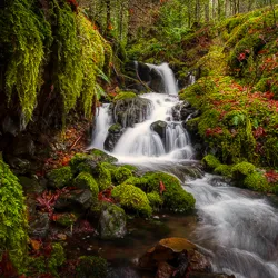
The Charming Northfield Falls in the Heart of Beach Estate Park
Looking to kill off an hour while in Nanaimo, BC? Just a short hop-skip and
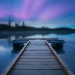


Looking to kill off an hour while in Nanaimo, BC? Just a short hop-skip and

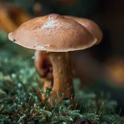
Photography can be a fulfilling and enjoyable hobby that brings a creative outlet to your

Welcome to our guide to Photoshop tutorials for beginners: A Complete Beginner’s Tutorial for Learning