
Photography as a Hobby for Beginners: Unlock Your Artistic Vision
Photography can be a fulfilling and enjoyable hobby that brings a creative outlet to your


The term ‘Colour theory’ comprises conceptual definitions and applications of colour as a design in artworks. It provides a coherent framework for the usage of colours.
Before getting into colour theory, let’s have an introductory discussion about colours and how they are produced.
Light is the essence of human vision; the root of any photograph. No photograph would exist if there were no light. If you don’t want to capture something, just ‘black,’ ‘LET THERE BE LIGHT.’
The process of capturing light energy and displaying them in digital information (known as digital images) is called digital photography. The captured light is processed and finally expressed as a photograph.

Colours originate when light exhibits light waves containing light energies of different frequencies in different wavelengths visible to our human eyes. It is called visible light.
Different colours mean different light energies with different frequencies and wavelengths.

Light’s wavelength can be defined as the distance between one light wave and another that contains photons that carry light energies.
A light wave with high frequency will have small wavelengths, and a light wave with low frequency will have large wavelengths.

Photons – quantum particles, carry light energy. These photons interact with our visual system and make vision possible.

Likewise, these photons carry light energy that contains information and corresponds with our cameras’ image sensors made of silicon. This interaction releases electrons – also quantum particles that are absorbed by pixels and processed into an electronic image, a.k.a a digital photograph.
Now that we know how colour originates, let’s jump into the fundamental attributes of colour theory.
It is a circle logically arranged with primary colours and variations. Some consider the colour wheel as the language of colours.
There is an absolute order of colours to denote and utilize them in a well-structured manner. The order of colours is classified as:
They refer to the traditional colours,
These are also known as pure colours. Every other colour we know of is derived from these three. Primary colours are the absolute types of colours, meaning they are not created from any combination of different colours.
Artists handle primary colours as tools to hold the eyes of viewers from not distracted from the subject.

These are the colours that are obtained by combining two adjacent primary colours. The combination takes place in a ratio of 50:50.
Examples:
Artists use secondary colours in their works to clinch more interest in the subject.

When you blend primary and secondary colours, you create a tertiary colour. Therefore, the combination percentage would likely be 75% primary and 25% secondary colours or 25% primary and 75% secondary colours.
Example:

If you ought to give your viewers engaging visuals and out-of-the-world experiences through your photo or art, you might want to try these tertiary colours.
The number of combinations one can get by combing different colours is nothing but infinite.
It is the projection of all possible colour combinations of an object. This is used to take note of the colour information of the object and make it easy for editors to make it harmonious if it is not.
A colour space is generally made up of the colours red, yellow, and green.

If you are familiar with photo editing software like Photoshop, Lightroom, and Affinity, you might have encountered something called HSL sliders (in some software, there are HSB sliders).
An HSL slider stands for Hue, Saturation, and Luminance slider (HSB stands for Hue, Saturation, and Brightness). You can use these variables to derive a variety of colours you use.
Let’s briefly look into these variables.
It is the purest form of colour with no shade of black, white, or grey. But keep in mind that all hues are colours, but all colours are not hues.
To produce different colours, hues are tinted, shaded, and toned. Let’s discuss them in subsequent topics.

To bring out the purity of a colour, saturation is applied. It refers to the control of the colour’s intensity in a piece of art.
Photo editors saturate and desaturate photos to make a colour stand out from other colours.
You can desaturate a colour by tinting and/or toning it.
You can discover a great example of saturated colours in nature; colours on an object directly hit by sunlight will look more saturated than those in an object not greeted by sunlight.

It can be described as the weight of light in a photo, an absolute quantifier. Luminance indicates the sheer intensity of light that comes out of a colour and is received by our eyes.
The way and perceptivity of how our eyes handle luminance are called brightness. The brilliance of colours tends to be perceived entirely dissimilar from various viewing angles.
Brightness is a perceived quantifier, unlike luminance which is an absolute quantifier.
A brightness bar ranges from dim luminance(low brightness) in the low end to brilliant luminance(high brightness) in the high end.
The brightness of colours changes according to their surroundings
Some other aspects and actions contribute significantly to applying colour theory in photography.

Let’s say we compare two objects of different colours. One is a blue-coloured doll, and the other is a completely white ball. Once these objects are compared, our brain will filter how much brightness and white the blue colour in the doll exhibit relative to the white ball.
Therefore, lightness is (once again) our perception of brightness compared to white. However, it does not take into account the information of the colour but only the amount of white (or black) contained in it.
Lightness is also known as luminosity.
The bar that indicates a colour’s lightness is called the tonal range/tonal scale.
At the low end of the tonal scale is complete darkness, i.e. 100% black. At the high end is absolute brightness, i.e. 100% white. In the middle of the scale sits grey and its shades, i.e. 50% black + 50% white.
Naturally, an item that is entirely black or white doesn’t exist. The luminosity of most of the colours found on our planet fall in the middle part of the spectrum.

It is the process of increasing the magnitude of white, resulting in increased luminosity. As a result, the tonal scale will be inclined towards the right.
Tinting an object will make it appear distant in a picture.

As the name suggests, it is the process of embedding shades, a.k.a, darkening a colour resulting in decreased luminosity. As a result, the tonal scale tends to fall on the left.
Contrastingly to tinting, shading will give an effect to the object that makes it look as if it is closer than any other object in the image.
Ensuring a solid grasp on these aspects and attributes of colour theory will empower you as a photographer or a photo editor to exploit the unexplored depths of colours to ensnare a one-of-a-kind photograph and perpetuate colour harmony in it.

Photographers and artists combine colours to display their work in a way that looks aesthetically pleasing and kindles some feelings or emotions in the viewer’s heart. This practice of blending colours into artworks is known as bringing harmony through colours (colour harmony).
It has been proven scientifically that particular colour compositions pull audiences towards the art while some poorly executed colour combinations make them stay away.
The right combination of colours means precise communication of thoughts without any discomposure, and the wrong variety of colours means confusion and a chaotic chain of ideas in the minds of viewers.
The Colour wheel is the principal tool to derive colour combinations by instigating colour harmony into the works.
Color harmony in photography establishes excellent communication between viewers and artists/photographers through art is the primary intention behind utilizing the knowledge of colour theory to instigate colour harmony in photographs and crafts.

You don’t have to sneak into a photo editor’s studio to see for yourselves the mystical process of bringing harmony to arts through colours. As in most cases, mother nature is the best teacher for this as well. Colour harmonies can mostly be seen in nature.

Can you now get why people with aesthetic expectations stare at flowers, sunlight, or greenery landscapes for a prolonged period to induce thoughts and emotions in their heads and hearts?

Colour harmonies embody warm and cool colours that catch viewers’ eyes and make them look all over the art. These colours create a mood and touch the emotions of viewers.
For example, red will swiftly catch the attention of viewers and reflect a feeling of importance and caution, while blue will give a soothing sensation to the eyes of the viewers and bring calmness to their minds.
Every piece of art stands on a key colour, a.k.a. The dominant colour. It is the predominant colour chosen for adding to the image or art. Therefore, colour harmonies revolve around one key colour.
With the knowledge of how colours affect our minds, let’s briefly learn about the different colour compositions that bring harmony to images.
From the colour wheel, three colours are chosen in a way that they all situate away from each other at equal distances; those three colours should be like three points of a triangle.
For example, yellow, red, and blue form a triangularly spaced colour scheme.
Since the colours are relatively distant from each other, they produce a contrasting finish to their work. Triadic colour harmony has one key colour (often a primary colour) and two subtle colours (mostly secondary colours but primary colours sometimes). Artists avoid tertiary colours because they may give a less-clean look to the art.
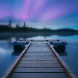
Two colours that lie opposite each other in the colour wheel are taken to establish complementary colour harmony (a.k.a direct colour harmony).
For example, if an artist uses red as the key colour, another colour would be green as it lies complementary, i.e. opposite to red.
This type builds high contrast between the colours used while snapping any unwanted attention directed towards trivial objects in the art. Complementary colour harmony can level up the photograph clicked by making it stand out in a pool of other less-vivid images.
Find here some of the aesthetic shots taken by photographers and artists by utilizing the complementary colour theory.
This colour harmony type includes three colours. Those are:
For example, if the key colour is red-orange, the split complementary colours would be blue and green.
This type of colour harmony is used to give the readers a ‘reduced mental uncertainty’ feeling compared to the complementary colour harmony images.
One key colour and three subtle colours are chosen from the colour wheel in such a way that they are placed at an even distance from each other, and each colour acts as a point that you can join to form a square.
For example, violet, yellow-green, blue, and orange can form a square around the colour wheel.
This type of harmony is used to differentiate a single object(with the key colour) in the art from every other element.
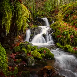
Harmony, in this type, is brought about by employing three colours that lie beside each other on the colour wheel. One-colour is chosen as the key colour and used predominantly in work, while the others will be used to support the dominant colour.
This is the most found colour harmony in nature.
For example, blue, blue-violet, and violet sit beside each other and help to pour analogous colour harmony into a work.
Using this type of harmony will give an overwhelming overall tone to work and help the viewers see the whole picture. In addition, it provides a dynamic and serene feeling.
As in most fields of knowledge on this planet, mother nature is a great teacher for colours and harmonies too. Pulling off a perfect shot of an image can be a tough job. Colour grading to match the mood is much more challenging. That’s why one should always keep studying the light and colour of images. New ideas and perspectives might eventually branch out if you keep constantly learning. Understanding more about colours will help you get closer to nature’s way of exiting, which is a never-ending journey.
Photography can be a fulfilling and enjoyable hobby that brings a creative outlet to your

Welcome to our guide to Photoshop tutorials for beginners: A Complete Beginner’s Tutorial for Learning

Creating stunning images is all about nailing the perfect colour grade. It’s what makes your