
Photography as a Hobby for Beginners: Unlock Your Artistic Vision
Photography can be a fulfilling and enjoyable hobby that brings a creative outlet to your


It’s no surprise that the colour of our surroundings might have an impact on our emotions. For example, have you ever noticed that you feel more energetic in a yellow room or more relaxed in a blue room? It’s not something you’re imagining. – studies have shown that colours can indeed influence our emotions.
For one thing, specific colour can affect our hormones and neurotransmitters, which in turn can influence our moods. Additionally, colours can be associated with certain memories or experiences, affecting our emotions.
Here are a few mood-boosting colours to consider:
Red also has a lot of symbolic meaning. Red is usually associated with danger, fury, and excitement. It’s often associated with danger, so it might be a good idea to avoid wearing red if you have a high risk of angering others. However, red can also have positive associations. Red is often associated with love, desire, and passion. This intense colour can make you feel passionate and excited, so it might be a good idea to wear red if you want to feel more energetic!

Orange is a happy and cheerful colour. It’s often associated with warmth, sunshine, and positivity. It also evokes a feeling of renewal, which makes it a perfect colour for the start of a new year. In fact, many cultures use orange as their colour for the new year.
Orange is a bold colour, which makes it a brilliant choice for projects that will be seen by many people. It can intimidate some people, so it may be a good idea to pair orange with a soft colour like blues or greens.

Yellow is another happy colour associated with optimism, joy, and intelligence.
This is because of its association with the sun, a source of light and warmth. Yellow is also associated with spring, a season of new beginnings, and is thought to promote new ideas and creativity. Yellow is thought to be helpful in improving memory.

Green is a calming colour representing nature, growth, and new beginnings.
The colour green is often strongly associated with nature and conjures up images of lush grass, trees, and forests. Green is frequently said to as a serene and energizing hue. Green is also frequently associated with wealth, good fortune, health, and envy.

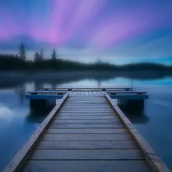
Blue is a serene and relaxing colour . It’s often associated with peace, stability, and trust.
Because of its widespread popularity, blue is frequently thought of as a non-threatening hue that might appear conventional and conservative. The colour blue conjures us thoughts of tranquil or peace. It is frequently characterized as quiet, secure, peaceful, and well-organized. A common symbol of stability and dependability is the colour blue.

Purple is a royal colour that can represent luxury, wisdom, and creativity.
Blue’s tranquilly and stability and red’s ferocious intensity are combined in purple. The attributes of monarchy, aristocracy, opulence, power, and ambition are frequently connected to the colour purple. Wealth, extravagance, creativity, knowledge, dignity, grandeur, devotion, tranquilly, pride, mystery, independence, and magic are some connotations associated with the colour purple.

These are only just a few drops from the chromatic ocean of how colours might influence your moods. Now you may ask how to take advantage of this quality of colours for photography. That is where we arrive at the concept of colour harmonies.

It’s the use of colours that work together to create a certain feeling or mood. Different combinations may be used to produce a variety of outcomes, and there are a few basic types of harmony that are commonly used. It’s also often used in other fields of applied arts like graphic design, web design, and even interior design.

Colour harmony is essential in photography because it can help create a sense of balance and unity in your photos. You may produce aesthetically appealing and eye-catching images by combining colours that go well together. For example, using warm colours like red and orange can make a photo feel more intimate and inviting while using cool colours like blue and green can make a photo feel more calming and serene.
Colour harmony is all about creating a cohesive look for your work. A good colours scheme can make your photos more recognizable and memorable.
Perhaps one of the most stunning aspects of nature is how colours seem to blend effortlessly. And it turns out there are some pretty exciting things going on with colours harmonies in nature.
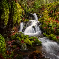
You can find some of the most stunning colours harmonies in nature. The colours of a sunset, for example, are perfectly complementary. Blue and orange make a beautiful contrast, as do green and red.
There are several instances of analogous colours schemes in nature too. These are colours that are adjacent to one another on the colours wheel, such as blue and purple. Analogous colours schemes create a sense of harmony and can be very pleasing to the eye.
(Wait a minute! Now, what is a colour wheel? It’s a tool that artists use to help them mix colours . It’s basically a big circle with different colours on it.)

Of course, not all colours combinations are created equal. Some colours don’t go well together. If you’ve ever tried to wear a shirt the same colours as your pants, you know what we’re talking about.
But even when it comes to clashing colours , there’s a reason why some combinations work better than others. It all has to do with the way our brains process colours .

The first step is to grasp the fundamentals of colours theory. This will help you identify which colours work well together and create pleasing results. You can then use this knowledge to compose your shots in a way that uses these harmonies.
There are a few distinct sorts of colours harmonies that are frequently used in photography.
The most basic colours combination is the complementary colours scheme, which uses two colours on opposite sides of the colour wheel. This creates a high contrast look that can be very striking.
Another popular colours combination is the analogous colours scheme, i.e. colours that are next to each other on the colour circle, such as red with blue. This creates a more subtle effect and can be used to develop a sense of depth in your images.
Finally, the monochromatic colours scheme uses only one colours throughout the image. This can be a very effective way to create a cohesive look, especially if you are shooting in black and white.
Types of colours harmonies that one can use are not limited to these three. There are more of them, like split-complementary colours harmony, triadic colours harmony, tetradic colours harmony, etc.
Once you have chosen the colours scheme you want to use, you can start experimenting with different ways of using it. A straightforward way is to use a single colours for most of the image, with the other colours being used as accents.
You can also try using different tones of the same colour to create different effects. Blue sky and sea, for example, may be differentiated with shades of light blue and darker blue respectively.
Remember that you don’t have to stick to just one colour scheme. You can experiment with different combinations and see what works best for you. The most essential thing is to have a good time and try things until you discover something you enjoy.
colour is a powerful tool that every photographer should understand. By learning about colour harmonies, you can create more visually appealing and impactful images. You’ll be able to create stunning effects with colour after some practice. So don’t be afraid to experiment with different colour schemes in your photography!
Photography can be a fulfilling and enjoyable hobby that brings a creative outlet to your

Welcome to our guide to Photoshop tutorials for beginners: A Complete Beginner’s Tutorial for Learning

Creating stunning images is all about nailing the perfect colour grade. It’s what makes your