Spinning Fire: A Guide to Steel Wool Photography
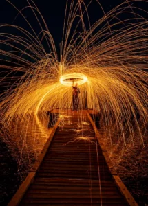
I think steel wool photography creates some of the most amazing images you can capture


I think steel wool photography creates some of the most amazing images you can capture

Long exposure photography is a technique that uses slow shutter speeds to capture silky smooth

The first time I went to the Medicine Bowls in Courtenay, it felt like a