
Psychology of Colour for Photographers: A Practical Guide
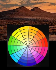
Colour is one of the most powerful tools in photography. It’s how people feel about


Colour is one of the most powerful tools in photography. It’s how people feel about
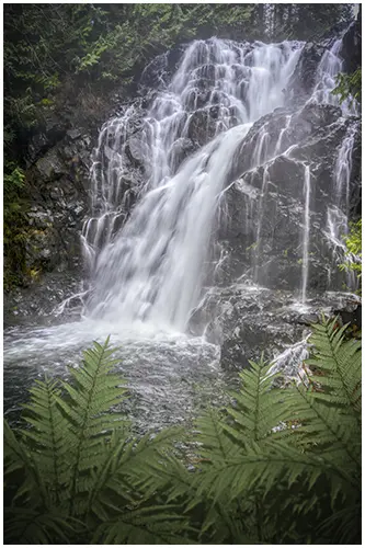
I’ve visited Trout Creek Falls multiple times over the years, and it’s one of those
Colour theory for photographers is something I never thought about when I first started out.